Gmail redesign—— 1
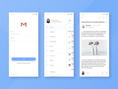


Looked for several different email software as a reference analysis, each application has a different focus, because it is redesigned, realized that Gmail's mailing function is the most important function, so the large suspension button was retained, weakened The color of the sidebar icons is more uniform in form. Added weather in the upper right corner to make Gmail better and easier to integrate into the user's life. In the mail section, the function of the font size has been increased to meet more different user groups, and the function of flipping up and down the mail that is not included in Gmail has been increased, and the speed of receiving the same personal information within a short time has been increased. Because it's a redesign, it doesn't use the main color red in Gmail. It's mainly not controllable.
