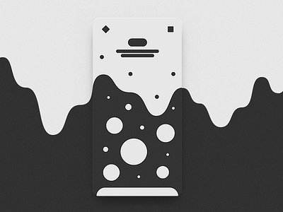
Abstract Ui #3
I see a lot of potential in this one. Negative space, depth, contrast — the kind of a combo that opens up a plenty of possibilities to explore both very symbolic and illustrative approach to say charts or maybe a set of options.
With a potential fallback to a more traditional navigational pattern like swiping in peeking elements. And I believe there's much more.
#abstractui
More by Nikita Zimin View profile
Like
