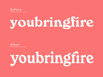
youbringfire Logotype
Why yes I'm still creating more logotypes for myself!
This piece was inspired by the above "font" which was discovered via a local mexican restaurant menu. I really enjoyed the reversed counters and angular forms and knew there was room to improve it.
- Each letterform was, of course, redrawn from scratch. Correcting the blobby "o" and "b" were obvious edits.
- Next, increasing the x-height to give this logotype a bit more breathing room and overall strength.
- Another issue was the "n" and "g" combo creating a large negative space. Luckily redrawing the loop of the "g" fixed this issue so they tuck nicely together.
- Lastly, correcting the angles of the "r" and "f" arms so they mesh a bit better with the angled "n" stem.
Interested in learning about creating your own lettered logotype?! Sign up for my workshop in SF coming up on June 16th!
