Borussia Dortmund
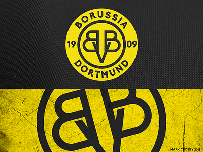
For some reason it has always bothered me that the V is higher than the B's in the BVB logo, and how poorly integrated every part of the logo is. Here's my shot at a simple cleanup.
For some reason it has always bothered me that the V is higher than the B's in the BVB logo, and how poorly integrated every part of the logo is. Here's my shot at a simple cleanup.