Bullet Graphs
Bullet Graphs
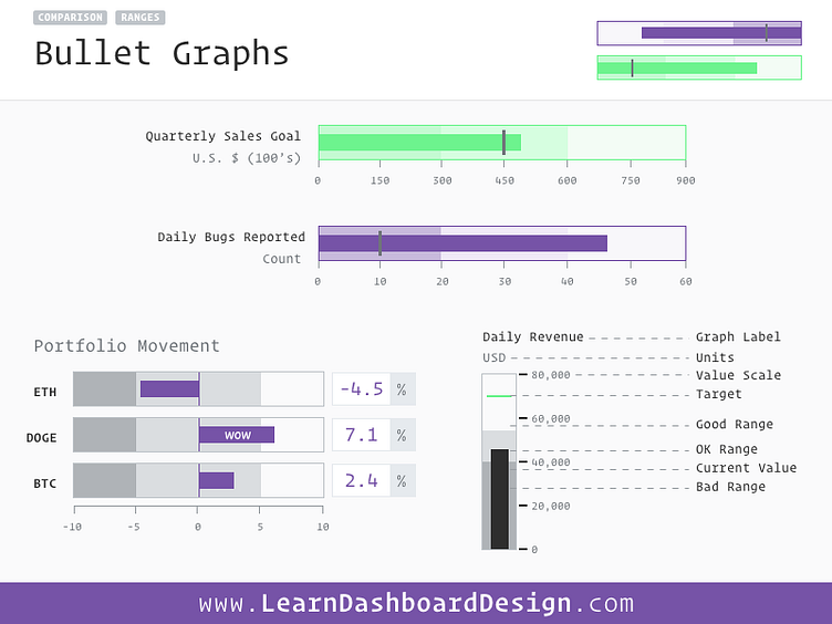
Taking inspiration from traditional bar graphs, the bullet graph packs in additional information and context for the user. While uncommonly used on software dashboards today, I believe more education in the subject will lead to them being more widely used.
The current value is depicted by the dark, solid bar at the center of the graph. You can include the target value as a lighter line within the bar. Finally, the background colors within the bar are gradient colors indicating ranges. These can be good - bad or anything else the data needs to have represented. Typically, the darker the area, the more of a “bad” connotation it has in a bar chart context, but your userbase may have their own connotations of how these should be designed.
Bullet graphs work especially well with multiple bars aligned together, for example replacing an entire bar chart. In this way we can add lots more context to a data visualization without taking up any more space.
