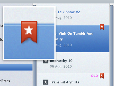
Bookmark Rebound
Just my two cents. Please take them for that value.
I like the addition of depth to the bookmark, but I feel like with that, the space it lives on top of also needs that same depth. I also moved up the bookmark by 1px to give it a feel like it actually wraps over from the back. You can see in the detail I added a 1px stroke highlight to the blue box 1 px below the top.
I left the original at the bottom for comparison.
Love this stuff. Keep up the good work.
More by Scott Williams View profile
Like

