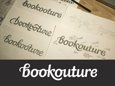
Logo development
Logo I'm working on for an eBook publisher. It needs to be stylish, clean, distinctive with a timeless quality and appeal to a primarily female audience. The name is a play on the words "book" and "couture", referencing that the books are perfectly tailored to the target audience, so we were looking at ways in which to link this within the lettering. The 'b' in particular has to be unique and own-able since it'll be used as an icon.
The 3 sketches on the left were the first set of proposals and explored varying extremes within the brief, from relatively restrained to very visual. The design was then revised mostly based on the top left version but bringing in the strongest elements from the other two. (Slight name update too to make its meaning more recognisable).
The idea is to suggest the movement and shape of thread within the 'b' in a subtle and elegant way that doesn't look gimmicky or hinder legibility. Looking for feedback - happy with it conceptually, but open to suggestions for any finishing touches or things that need fixing (for a start, there's something a little strange about that 'e' that I need to look at...) Thanks!
