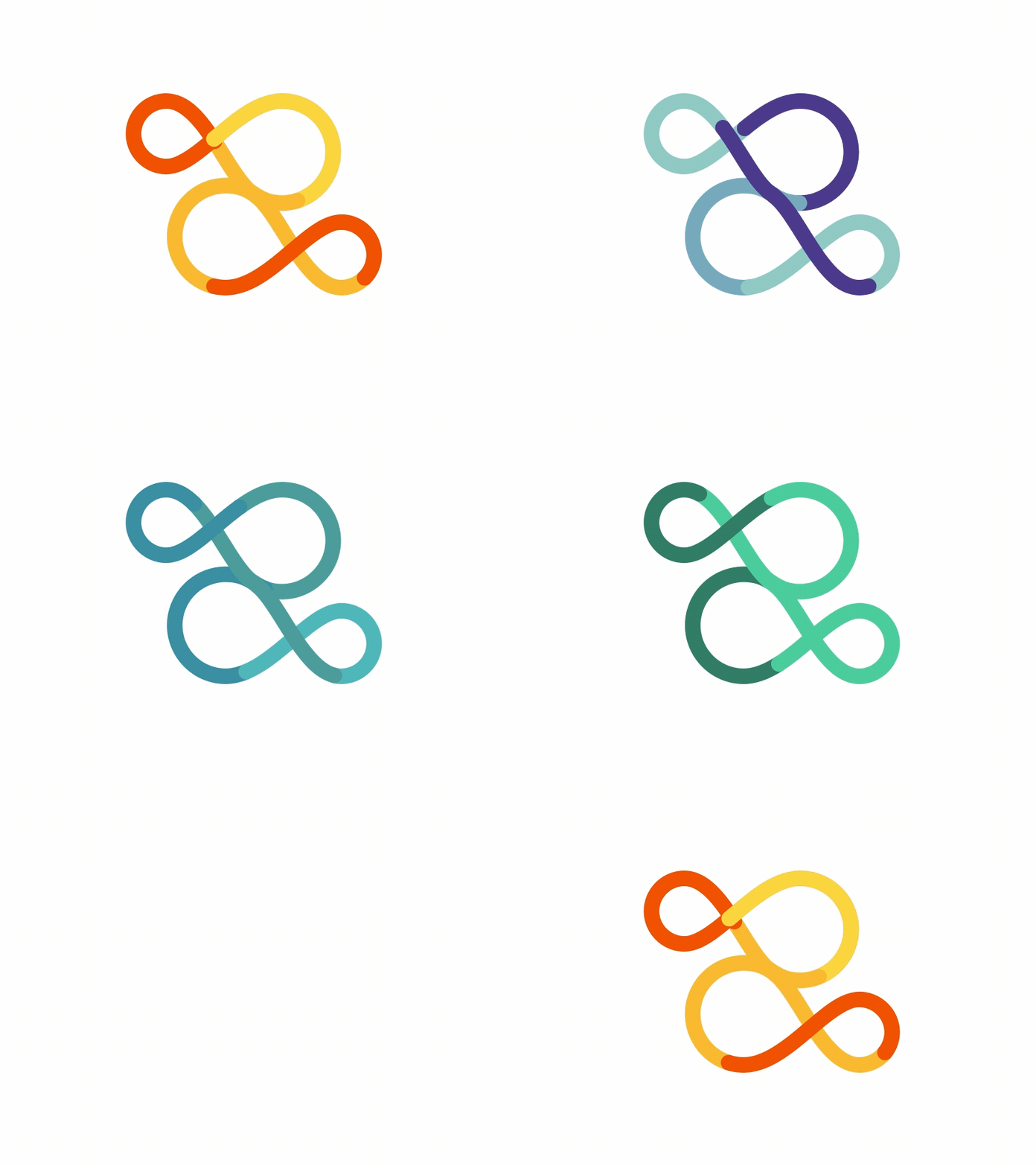
Zonda Logo Animation
Hi Dribbble!
Here's a short animation, showing the fluidity and smoothness behind our concept of the Zonda logo. Zonda is a mountain wind, and we wanted to relate to that in the logo. Seamless flow of colors and smooth passing, I think we got that. What do you guys think?
More by VKNGS View profile
Like
