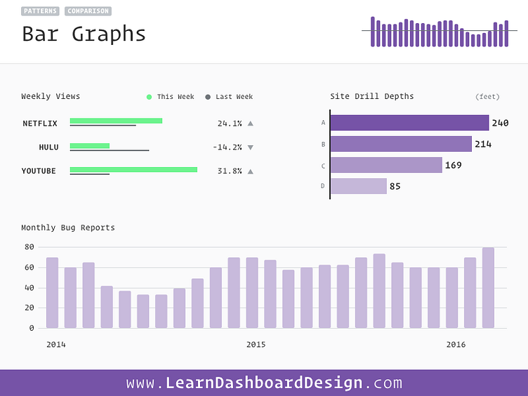
Bar Graphs
Bar Graphs or Charts are meant to display different values and allow the user to measure them by their difference in relative size. They work equally well on dashboards vertically or horizontally, though you may have issues incorporating labels on the x-axis with vertical bar graphs.
The two axis of bar graphs should include what is being measured as well as the measurement of scale being used.
To avoid misleading the user, always start bar graphs from 0 on the axis. Using a relative scale can lead to an implication of vastness in the difference between bars that may not really exist!
Selecting the right visualization to represent the data on a dashboard can be tricky – learn more at https://learndashboard design.com/
More by Ray Sensenbach View profile
Like
