Sparklines
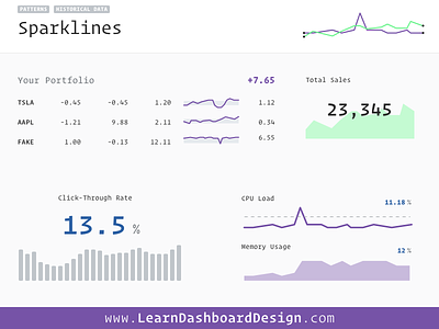
Sparklines are an excellent way to add historical context to otherwise static values. The inventor of sparkline, Edward Tufte, describes them as “word-size graphics” making them ideally placed in lieu of words. In a table, you can give the user much more information and context while using the same amount of space.
Sparklines give an “idea” of what’s going on, but they’re meant to be non-precise. In other words, they’re intentionally high-level data visualizations, making them perfect for use on dashboard interfaces! They leave out the details and allow the information to be understood by users at-a-glance.
While intentionally designed to be simple, sparklines can get incredibly specific and provide more depth of information by adding various graphic elements. Everything that you can add to a line chart, you can creatively minify and make useful in sparklines. Think about range bands, high and low markers, scaling, multi-line sparklines, median lines and outliners. The sky is the limit.