Landing Page
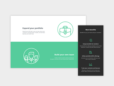
We need to communicate a straight forward concept to the user, that’s why we use contrasting colors to divide the information into modules.
🚀 We build bridges between brands and users in the digital world. We are #consultR
More by ConsultR View profile
Like

