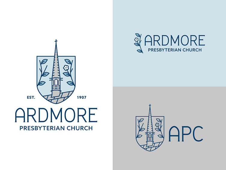
APC Logo Lockups
It has been my pleasure to work on the official logo for my home church.
Church branding is challenging–certain imagery, icons and symbols are used and shared across many denominations and it becomes difficult to come up with anything new, or to stand out. The leaders of the church also wanted to present APC in a "modern" light to appeal to a younger demographic. This is an easy trap for churches to fall into, and needs to be carefully considered. I knew that while it needed to reach out to new and younger groups, the logo also needed to feel familiar to the life-long members.
It was important to me to create something personal that pulled directly from APC's history. So while there is religious symbolism in many elements of the logo, they are also based in the reality of the actual church building and its past.
