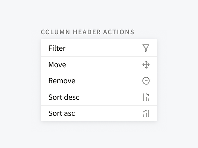
Column header actions
Columns in data-tables in MineralSoft have a ton of potential actions that a user can take on them—these icons were a way to avoid using a dropdown, and surface interactions faster for power users.
The filter icon is pretty standard—I used The Noun Project to get an idea of what people might expect from filter icons.
Move was a little tricky—I originally started with a <-> icon, because a user will only be able to adjust columns left or right (you can't pull a column up or down on a table), but people misunderstood that as "resize," hence the four arrow icon.
Remove was also dicey—a trash bin was read as "delete this data" which is something users absolutely do not want to do. The (-) was generally read as "minimize this column" which is effectively the action here (although it could also be read as "hide").
Sort ascending and descending were hard. I initially went with the traditional arrow, but that was seen as a way to hide the hover actions, rather than sorting. The graphs themselves weren't clear enough, but adding arrows clarified the intention of the icons.
On extended hover, users can also see tooltips explaining what each icon does. My hope is that, as users further interact with these icons, they'll learn the nomenclature quickly, and no longer need the assistance of the text.

