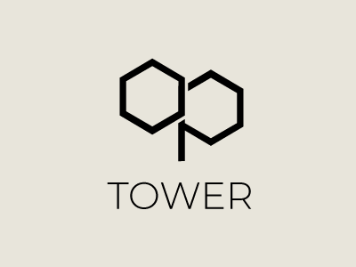
Logo
Client: OP TOWER
Industry: Workspace Solutions
Project: Logo Design
Concept Overview: OP TOWER is an innovative provider of flexible workspace solutions, catering to startups, freelancers, and enterprises seeking modern and adaptable office environments. The logo design needed to convey flexibility, modernity, and professionalism, reflecting OP TOWER’s commitment to fostering productive work environments.
Design Process: The journey began with an in-depth analysis of OP TOWER’s mission and the workspace industry trends. The chosen logo concept symbolizes adaptability and connectivity, essential traits for modern workspaces. It features an abstract representation of interconnected spaces within the letter 'O', which stands for OP TOWER and emphasizes the core offering of versatile work environments. The design combines simplicity with a modern aesthetic to ensure the logo is both timeless and forward-looking.
Color Scheme: We selected a palette of sophisticated navy blue and vibrant orange. Navy blue represents professionalism and stability, while orange adds a touch of creativity and energy, appealing to innovative professionals and dynamic companies.
Application: The logo is crafted to be versatile, ensuring it performs well across various media, from digital platforms to physical signage, making it a robust identifier for OP TOWER in all its business interactions.
Final Thoughts: This logo not only represents OP TOWER’s brand identity but also enhances its visibility and appeal in a competitive marketplace, solidifying its stature as a leader in workspace solutions.
