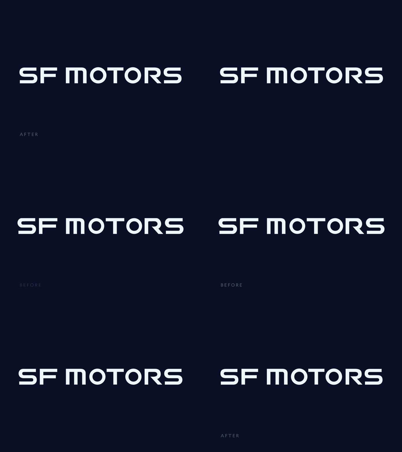
5 improvements for the SF Motors logo
I know these suggestions are subtle, but I love the design that @Gleb Kuznetsov✈ is doing with the interface and I want the lettering to have some nice finesse too.
- Increase /O size to not feel smaller than the rest of the letters. The /O should feel grounded like a performance vehicle instead of floating.
- Increase the width of the /M to match the density and width of the of the rest of the letters
- Decrease the width of the /T and /F crossbars so that the spacing and kerning can feel more refined.
- Balance the curves of the /S shapes so the top and bottom curves can feel balanced. More details in attached .gif
- Close the bowl of the /R to increase the legibility. Doing this will also allow the leg of the /R to be better positioned so the final /S isn’t pushed out too far and improve overall kerning.
Like what you see? Follow Stotion


