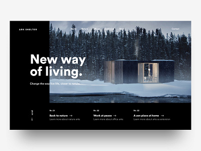
Arkshelter
'Sup guys
Here's another style exploration for the Ark shelter project i'm working on, in the end i decided to not go with this because of it being to dark in style in combination with the style of the images. Therefor i went with the white version you can see on my profile. I came to this conclusion by showing the design to some people how could posibly be the client and also to some other designers. Very insightful to show your work to other in the beginning of the projects. Anyways, i thought i'd share it with you guys!
Have a great day guys!
Peace!
————————————————
Want to learn design and/or animation?
Check out my classes on Skillshare.
Use the links below and get 2 months Skillshare premium for free!
Design class: http://skl.sh/2h4JrWa
Animation class: https://skl.sh/2D8StYQ
Thanks a ton to everyone that has checked out the classes or has supported me in the last years, you guys are the best!

