Box Plot with Whiskers
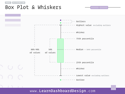
The Box Plot (with whiskers) is a nice way to visualize the range and distribution of a group of values in one graphic. The top and bottom of the rectangle represent some percentile of the overall values, while a line within the box displays the median value.
Outliers are values that fall outside of the normal range. They’re generally few in these graphs and fall outside of the whisker lines, which represent this normal range.
This specific example is a little too data-dense for your highest level dashboard interface. It can be simplified by removing the outliers and simplifying the whiskers to a line with no caps. This would also simplify the range to a solid 50% represented by the box area and 100% shown with the long whisker lines.
Also don’t forget these can be used both vertically and horizontally. Similar to a moving analog indicator, box plots allow us to present a ton of complex information to our users in a very small space.
****************************************************
****************************************************
Learn Dashboard Design coming soon – sign up to be notified when it launches at https://learndashboarddesign.com