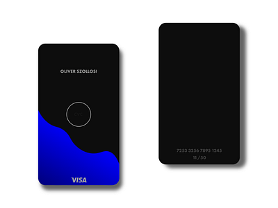
Credit card design
Hi!
As I look to my credit card everyday, I always thinking about it's design why does it look like as it looks like: crap.
Too much information, too much colour etc..
In my design you only see what you have to see.
Your cvc code is in the middle of the front of the card, but you only see it, if you place your finger there, with your finger's heat it appears for a moment or two. So it's seeable only when it's needed.
Other informations mainly for online shopping can be found on the back of the card, because it's not that important in everyday life.
I hope you like it!
More by Oliver Szollosi View profile
Like
