Destination Trip Logo
Project: Branding & Identity design Client: Destination Trips Pvt. Ltd. Design Studio: Create Cut Paste (CCP)
Branding & Identity design for a travel portal company that helps and manages your travel and hotel bookings. We designed stationery and branding for the company keeping it youth-centric, self-explanatory and yet it can blend into the corporate sector of the industry.
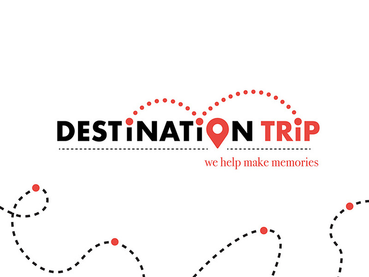
Approach: Destination means denoting a place that people will make a special trip to visit. So to express it I choose to use the letter " i " as a person/ traveller denoting his movement/ travel from one place to another, with the dotted path along with destination icon used to replace the letter "O". A dotted path under the word destination maintains the balance with tag line below and also gives us the sense of road map with the destination mark on it.