Homepage Design Animation for VR Headset Company
Hey homies!
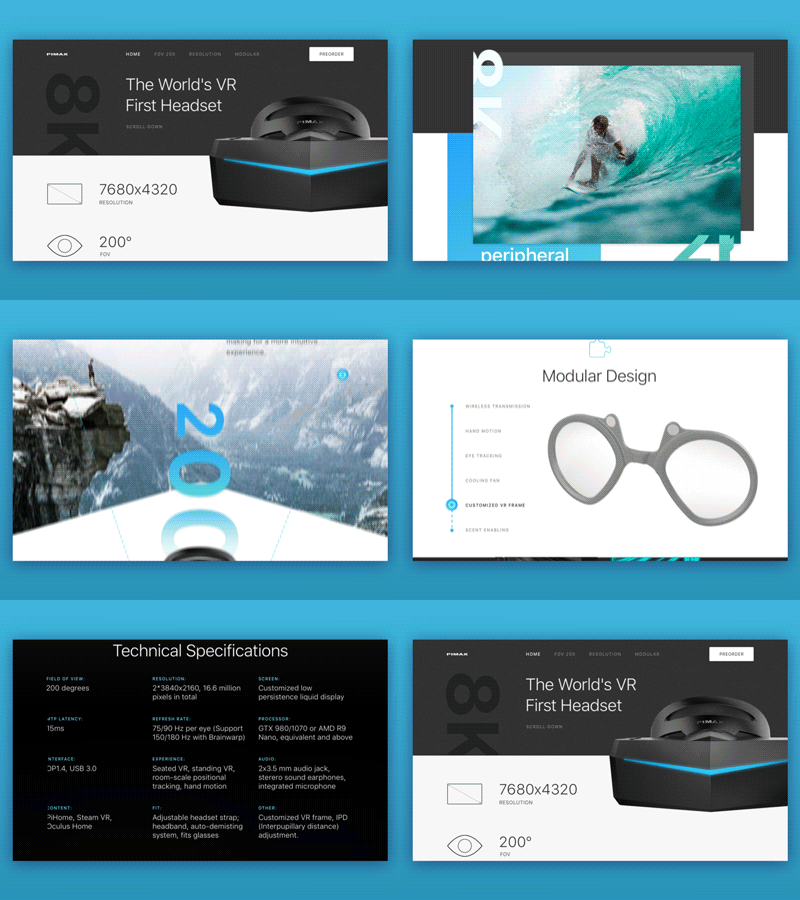
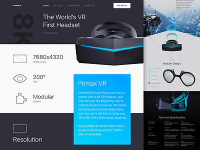
I've just animated the homepage we designed here at Zajno for a cool VR company.
Goals:
Making a top-notch website redesign for a cool VR company that was the first to market 8K VR headset. Our objective was to make a clean and trendy website to represent the company’s vision and the revolutionary technology they are putting into life. Animating the page to give you a clearer look at how users will interact with the page.
Approach:
In order to get the message across to site visitors faster, we decided to utilize clean and minimalistic design with attention to most important points rearranging the given content in a more visually appealing way. This included adding in some new pics and geometric patterns while removing unnecessary info, aligning the fonts and fixing graphics to improve the overall look and help visitors better understand the value proposition.
Results:
We ended up with a brand new, live and vibrant website with clean design, good "white space" utilization and attention to detail that allow attracting the target audience in a more efficient way. The animated version of it is should give you a better understanding of what the final product will be like.
What do you think of it? Share your feedback! I love hearing from you, guys !
Press "L" to show some love!
ᗈ Join our Newsletter!
ᗈ Website
ᗈ TheGrid
ᗈ Spotify
ᗈ Twitter
ᗈ Medium
ᗈ Facebook
ᗈ Instagram

