Downtown Memphis Commission Rebrand
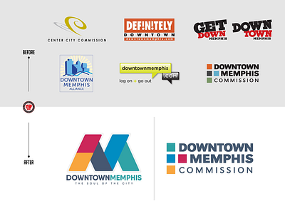
A rebrand of DMC I did in Sept. 2016. The organization has two identities it’s been using, “Downtown Memphis” and “DMC”. One focuses on development while the other focuses on vibrancy and highlighting the good/fun in Downtown.
Here’s a look at the various identities the Corp has had over its 40 year history and then to its current look. I used an “M” to give locals a sense of pride for Memphis. The “M” is an abstract representation of the Memphis bridge. I also changed the colors from mute red, green, blue and grey to vibrant red, orange, blue, teal and navy. This gives them a lot of flexibility with branding. Interested to hear your thoughts, Dribbble!
More by Chris Porter View profile
Like
