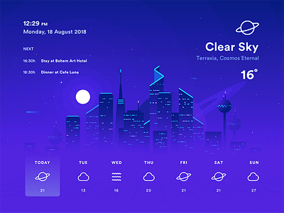
Weather App
Let's try something new with high contrast "Tron" like colors which I really like. Originally this was an illustration for a client, that didn't pass, but I have decided to play with it further and use it as a UI practice.
Couldn't decide which color to use... so I attached all three versions.
Hope you like it! :D Cheers!
You can find more of my work on my INSTAGRAM profile :)
Follow others: Tumblr | Twitter | Behance
Buy Artwork: Society6 | Redbubble | TeePublic
More by Marko Stupic View profile
Like


