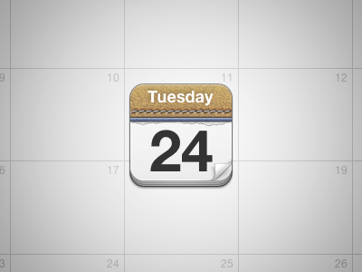
G5 Theme - MobileCal
I started this icon thousands of years ago, revised it half way through, then changed the look of it completely, then put it down for a week or so, and then finally made it all come together. The iCal look has been done many times before, but I'm sure there's a good reason for that.
The page curl may still undergo some minor fixes, and before I get people saying how the tip should be curved instead of straight, I know. I tried the curved tip and it simply can't look good on such a small scale. Realism be damned, I prefer this one. Critique much appreciated as always, and thanks for looking!
More by Andrey Grabarchuk View profile
Like
