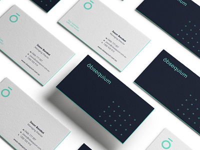
Obsequium Business Cards
Obsequium Brand Identity
--
The logo & wordmark is depicted with a simple, abstract halo hovering above the O, representing Obsequium’s ability to provide clear guidance & direction. This minimal line asset is, in fact a diacritic accent, called a macron. A macron is used as an identifier for clear, communicable & distinct pronunciation. Parallels were drawn between these formidable qualities & Obsequium’s ability to dramatically simplify their client’s risk & compliance challenges.
--
For the full case study please visit:
https://fableco.uk/portfolio/obsequium/
We look forward to your thoughts & feedback.
--
Fable&Co