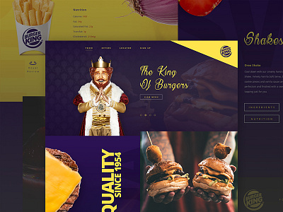
Burger King - Mock Concept
More of an experiment, for being the king of burgers their site/branding never seemed royal to me. This was initially supposed to be a quickie ui exercise, which ended up being a lot more fun than expected.
----------
Feel free to view the rest of my work on Dribbble, post any feedback, and hit the "L" button if you liked it. :D
----------
More by Daniel Fusniak 🎮 View profile
Like

