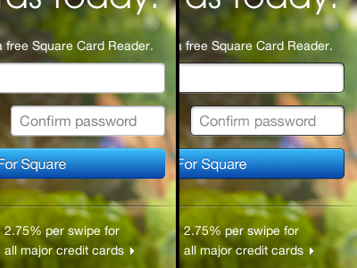
Square Button Makeover
First of all: I love Square and how it looks!
There is just one thing that bothers me when I look at the new website they pushed with the launch of Square-Register this week: the blue buttons. They're missing the depth, and also the hover-effect is just boring and ugly. (Also the fields in general look kinda off, but this varies with the background...)
I think a company like Square should focus on every detail of their product, even though if it's only us UI-freaks that actually care...
So I decided to upgrade the fields and (blue)buttons. See the attachment for a full-size before and after and button-effects...
Let me know what you think!
More by Jacobus North View profile
Like


