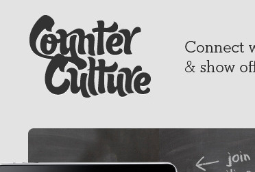
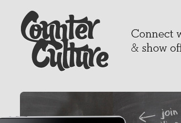
RB: Counter Culture
Hey Jay, thought it'd be easier to show you rather than say it. I'm really digging what you have going so far just thought the letters seemed a bit muddy. I thought they deserved a bit more separation and distinction for readability. Keep in mind this would still need a lot of work but it's a start. I'd say convert that bad-boy to outlines and go to town customizing it.
More by Aaron Anderson View profile
Like

