RUDDER
A very, very 'lean' design for a web app development startup.
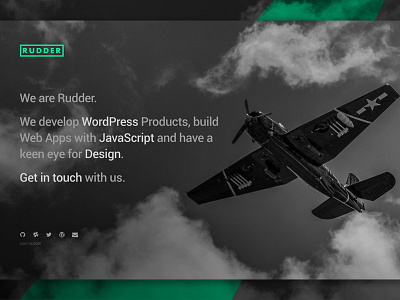
The name RUDDER, stems from that of a rudder of a boat or plane. A tiny but vital piece of the aircraft that is responsible for steering the direction of the vehicle it is attached to.
Some of the main focus words/phrases when building this brand were:
"subtle", "attention to detail", "important", "direction", "significant" and "efficient".
The company has a big focus on being 'lean', so much so that they want to bring this message across in their brand too. Everything from the logo to their website is aimed to get information to their clients as quickly and efficiently as possible. The focus is not on how great "Rudder" is but the focus is on how great their "clients" are. Less about them, more about you.
The logo is neat, compact and... well... 'lean'. It is durable and can work on various media.
The website is a simple landing page with a few outbound links to relevant work, GitHub repositories and email (mailto:) links.
Nice and simple.