Toast Messages
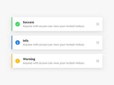
Worked on designing some new toast/flash messages for our dashboard.
We previously had coloured background ones that made readability more difficult and meant using different coloured links when applicable. This gives us much more flexibility as well as higher readability and consistency throughout the product.
Shoutout to @Amy Devereux for the 🔥 icons!
Be sure to check out our new design team site http://envoy.design ✨
More by Envoy View profile
Like
