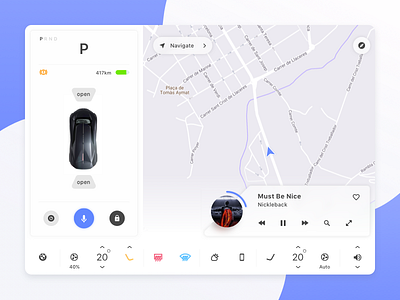
Electric Car Touchscreen Design
Had fun designing this electric car touchscreen for a design challenge last month.
I think the opportunity around designing great experiences for electric vehicles will huge in the years to come.
One of the main problems i've tried to tackle with designing this experience is finding an efficient way for the driver to use the control settings of the car... But more on that in my next post!
Here are a few things i've looked out for while designing this:
- The transition from the instrument panel to the touchscreen, controls, knobs, etc. should keep the same feel and look for the driver as well as the passenger.
- Viewing distance — should take into consideration that the driver and the passenger will usually be at one arm length’s distance from the touch screen
- Design layout should feature night more and day mode (depending on moment of day for providing a better driving experience)
- Colors are important, we should use colors that are not distracting the users attention (not a lot of red or other high intensity colors)
- Provide clear visual or audible feedback after an action. Important for driver to know that the action he was taking finished with a result (or not)
- The design should have a modular layout for left side road drive markets (UK, Australia, etc)
- Actions you can do while parked should be different to actions you can do while driving
- Each driver has different preference while driving so the possibility to customize the layout in a certain amount should be taken into consideration
- Gestures allow for an easier use of the interface which is important when the driver is engaged in driving the vehicle
