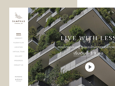
Samphas Homepage Design
A website for a new condominium in Bangkok. it's a one page website so I have to pack everything in a limit space. I use left main navigation because I think it's good for story telling and it's pretty unique.
PS. the photos shown in the mockup are not the real photos of the project.
More by paipure View profile
Like

