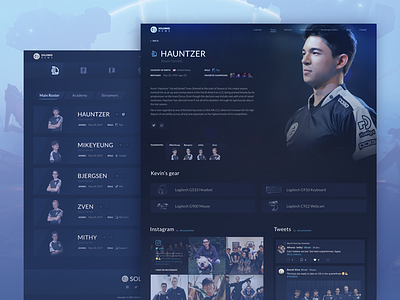
Teams Page Design for eSports Organization Website
Hey folks!
While the brand new website for Team SoloMid is still under development, we’d like to share some more designs we created here at Zajno for the guys. This time it’s the teams page where users can see each team's roster (on the right) and learn more about each player (on the right).
Goals
We were tasked to redesign the team’s website making it more informative and improving the style a bit, so that the fans could easily find all the info they are interested in and the website looked modern and matched the gaming world nature. You can check out the current version of the website here. Stay tuned not to miss the release of the new one! ;)
Approach
Since our key objective was improving the website’s information architecture and making it user-friendly for the target audience which mainly consists of the team’s fans, we decided to display the most interesting for fans info on the homepage. However, we also decided to add such pages as Teams, Calendar, Achievements, Partners and branding Gallery so that fans could learn more, easily finding any info they need. In terms of style, we kept within the dark color palette and tried to discover a design approach that would match the esports aesthetics the best.
Results
What you see above is just a glimpse at what we ended up with. But there’s more, we’ll share it as soon as the website goes live which won’t take long. Keep in touch and stay tuned to see the entire thing! We’re looking forward to hearing from you!
BTW, what’s your favorite esports team?
Don’t forget to follow Zajno on social media and feel free to drop us a line:
Website | TheGrid | Twitter | Instagram | Medium

