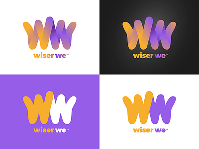
WiserWe - Logo Concept
Potential client's brief:
My business provides result-oriented mentor and coaching services in personal development. The business focuses on individual healthy lifestyle essentials; improvement of self-awareness and identity; enhancement of the the quality of life and contributions to the realization of dreams and aspirations, career advancement, goals and personal achievements; development of talent and potential.
My take:
Playing off of the idea of being "the boss" and in full charge of yourself (a king or queen), the silhouette of the symbol forms a stylized crown. It is also interpreted as 2 letter Ws for 'Wiser We', and is a subtle form of 2 people raising their arms in unison to announce a champion (think of when a boxer wins a match). It works in both gradient and flat colors. The 2 colors I chose (golden orange and purple) are meant to signal the color of royalty. I am a Boston Celtics fan and this reminds me of the LA Lakers and that's not cool at all.
