That Chocolate - Packaging Design
That Chocolate is a chocolate brand and social movement rolled into one. They create raw, vegan, allergy-free chocolate products, jam-packed with probiotics. And what’s more, each bar purchased funds a meal for a child living in poverty!
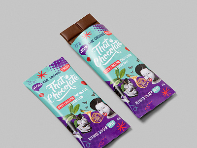
We designed the business's brand identity, logo and packaging. The goal was to develop an engaging aesthetic that not only captured the attention of the typical health-food market, but a wide range of consumers who may not regularly interact with health-food products.
The logo uses custom-drawn typography with smooth curves to communicate the creaminess of the product. It includes an 'ok' hand symbol to indicate a stamp of approval, letting consumers know that this brand is trustworthy, health-conscious, and socially-minded.
The packaging for the brand's flagship chocolate bar incorporates a fun, quirky, whimsical collage. For the children’s Happy Belly Bunyip range, we engaged a specialist character illustrator to perfectly capture the mischievous bunyip we had in mind. With both products, and the associated point-of-sale packaging, we were conscious of building a cohesive brand story, using defined colours, typefaces and design treatments to tie everything together.