Checkout UX
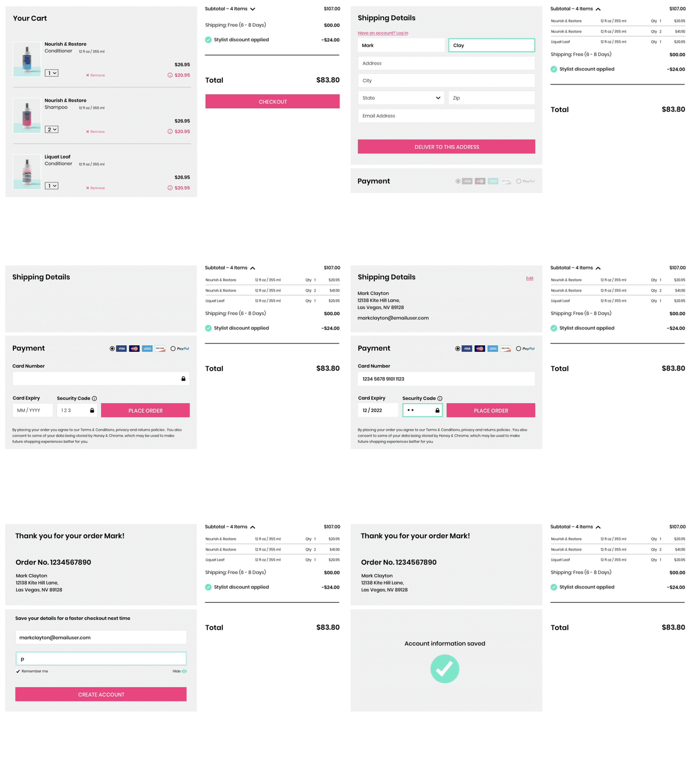
Dribbble tends to favour the shiny stuff, but I thought I'd upload this UX I've been working on for a shopping cart for hair products.
It's a clean and clear execution with no page refresh points along the way. A user is able to quickly and easily checkout their order, add delivery and payment details in one smooth process.
A prompt to save their details is issued after the transaction, so not to interrupt the payment process.
More by Mark Clayton View profile
Like
