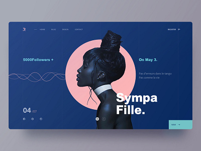
website3-Sympa Fille
This is the third attempt on page layout and color. It's the third one of the series. This time I boldly used the contrast color, highlighting the silhouette of the cool girl. Wish U like it!!!
More by RED View profile
Like

