NEW LOGO for Laura Amalie Graphics
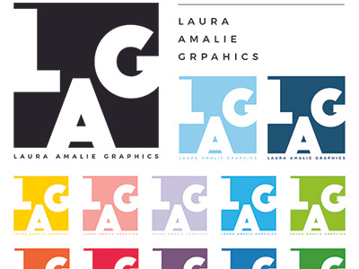
I decided to remake my - this was the result.
The black and the two blue ones at the top will be the main ones. The other colors would be for other purposes where another color matches better.
I wanted the logo to express me as a designer. Minimalistic, colorful, geometric (probably didn't get that one here) and clean design.
I would love to hear your thoughts - did it give you the impression I wanted to express?