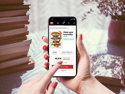
Martinus web redesign
This mobile screen shows product detail.
The purpose of redesigning the Martinus website was to refresh the 5-year-old design and clean it up into a clear set. We were inspired by the stone shops and their amazing staff, which was always kind and willing to help customers to discover a good reading.
We wanted to transfer this experience to the web using thematic collections that these librarians regularly compile. Content, catalog, search, offers of alternative products, and user reviews were important in discovering content. Upon purchase, customers wanted to choose the format of the book or send it as a gift.
We designed a total of 134 screens in the project and tested them for more than 60 people. Thanks to the Lean UX method and great collaboration with the client, the site was launched for 7 months from the start.
Lighting Beetle*
https://www.lbstudio.sk/
