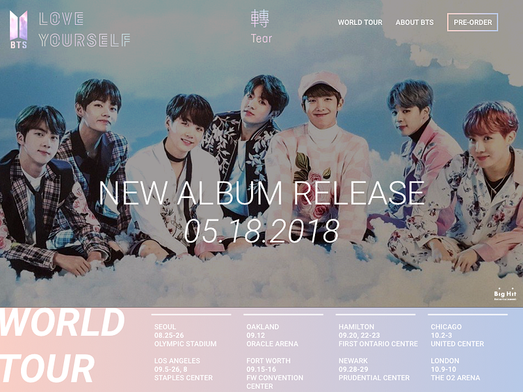
Day #003 - Landing Page
This was a fun experience! BTS, one of my new favorite music band, is releasing a full-length album this month, and their 2018 world tour tickets went on sale for my area this week too.
The official website has the newest teaser videos, but lack navigation to pre-order their new album, and information on their 2018 world tour.
This is my take on what that above the fold website landing page would look. Key features: BTS logo with their album concept (LOVE YOURSELF: TEAR) in the header with navigation buttons to learn more about the "World Tour", "About BTS", and "Pre-Order" their new album. In the hero area is their new album release date, followed by the above the fold list of the world tour dates. (This list is longer than what's above the fold, but because it's a second layer of information, it can be accessed either through scrolling down by the user or by the user clicking on the button "World Tour".
