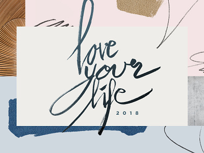
2018 Love Your Life Womens Conference
We end up using a different look for the style frame. Lettering, no image, pastel color, drawing element, and a few textures. It feels very simple. Can't wait to work on the marketing piece. What do you guys think? Feel free to add ideas for any good/interesting marketing piece such as social media ad, handout, etc.
More by Andreas Jap View profile
Like

