Identity & Branding Design V2: Festival of Indie Games (Final)
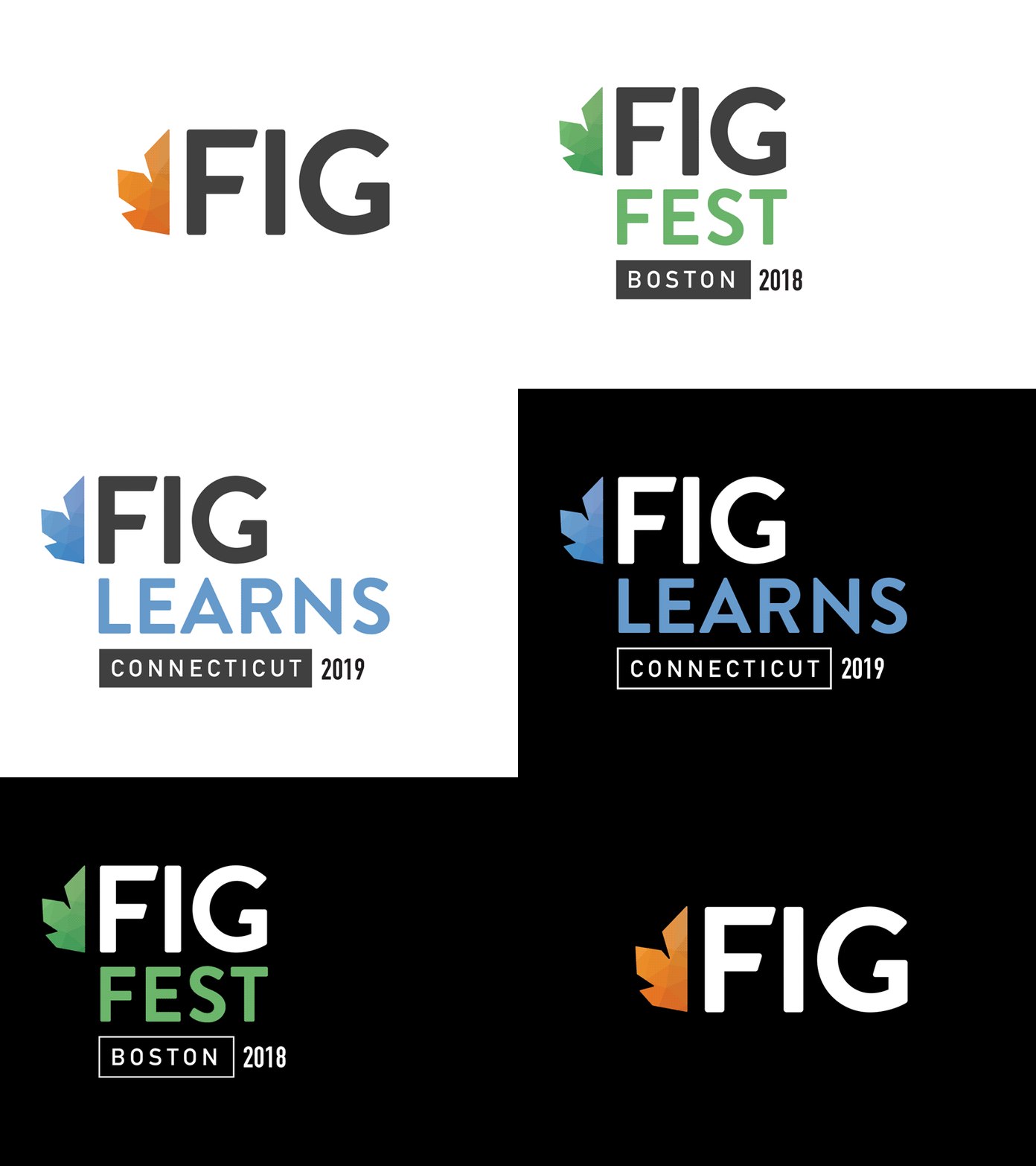
The final version of the logo for the Festival of Indie Games. This is an annual festival with different events that takes place in varying locations (city or state) each year. The logo had to work in standalone form as well as locked up with the event name, location, and year. And of course, it had to work on both white and black backgrounds and had to be legible from great distances (when used on flags, event billboards, etc.)
I went with a very modern and clean aesthetic here, relying almost exclusively on the typographic hierarchy to convey the fresh feel of the festival. The typeface is a tweaked and modified version of Brandon Grotesque, which works quite well for legibility thanks in part to its thick stems and large counters.
Color is being used as a visual differentiator for the event type, and the hues were carefully chosen so that they would not cause any color vibration when contrasted against both very bright and very dark backgrounds.
The iconic fig leaf that the festival associates itself with was also preserved. I vectorized the leaf in order to reduce its complexity and make the angles of its outer edges feel more in line with the typeface I'm using in the logo. Added a polygonal pattern (a commonly used art style in many indie games) within the leaf to represent the modern evolution of the brand.
I ended up going with a half-crop of the fig leaf to create some interesting visual symmetry with the "F" portion of the logo, where i think it creates some great compositional balance. Overall, I'm quite pleased with how it turned out and am excited to see it in action.
