Corona Gold Brand Book
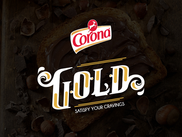
The logo concept of design is based on a typography of the brand name, it's written in italic which is known to be used to convey movement and power but in our brand it's used with an angle not more than 85 degrees with the curves that's used in the typography all together to give an artistic look to the logo with the splashes and spirals coming from the shape of spreading chocolate on the sides of the logo also to make our brand elegant and unique.
Check the full project on my behance portfolio https://www.behance.net/gallery/62220369/Corona-Gold-Brand-Book
