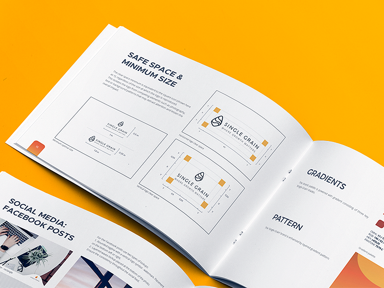
"Single Grain" Brand Book preview
I had a pleasure to work on Single Grain logo and identity rebranding.
Single Grain is a digital marketing agency is focused on the idea of growth and helping clients to boost their revenues.
This design is inspired by grain shape, energy flow, positivity. The style of the icon is bold, features strong brand mark with a vibrant, modern style. In addition, the design symbolically communicates the company title - one (single) grain.
The main focus of this design is a multi-color gradient, creating depth, energy. The icon is combined with a light, elegant typeface.