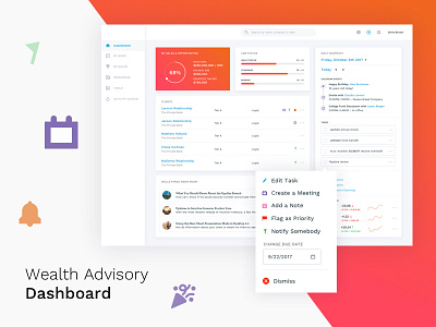
Wealth Advisory Dashboard
A large financial institute approached us with an outdated and clunky user interface for their wealth advisory interface. Our goal was to provide them an updated look on their robust interactions while adding new features to enhance the whole experience. We needed to make sure we chose a design path that would allow for future features to be easily added. This is still a work in progress but is getting closer and closer to production ready.
More by Method View profile
Like

