Braze Magazine, Discovery and UX
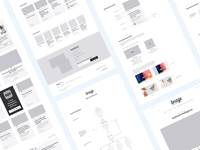
We're working with our friends at Braze, reimagining their blog experience. While there are lots of little things along the way, we've approached the project in these four steps. Check out the attachments for more details!
Step 1 - Site and Content Audit
We took inventory of their current architecture and recommended changes to the structure in order to align with their business goals.
Step 2 - Card Layout
Early on, we knew we wanted a card-style UI so we crafted the perfect hierarchy, balancing between images, headlines, and various supporting copy.
Step 3 - Card Modules
In order to keep the layout fresh and offer the maximum amount of flexibility, we designed multiple card layouts. This ranged from super small to extra large.
Step 4 - HiFi Wireframes
Finally, once all of the planning and foundation was built, we were ready to start wireframing the core desktop experience. We sought approval in all the previous steps, which made designing wireframes that much quicker.


