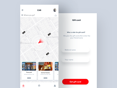
Recommended places
Sometimes we confused where to hangout on weekend, so we usually go to google and check for places then book the cab, How might we change that experience and showcase the most visited places in cab booking itself?
UX case Study,
The New York Times app
`````````````````````````````````````````
Resources might be helpful to you
1.) Micro-Interaction tips youtube
2.) UI design tips youtube
3.) Process of Interaction design
4.) Case Studies and design tips
5.) Instagram updates
-----
Contact: hi@johnyvino.com
---
More by Johny vino™ View profile
Like
