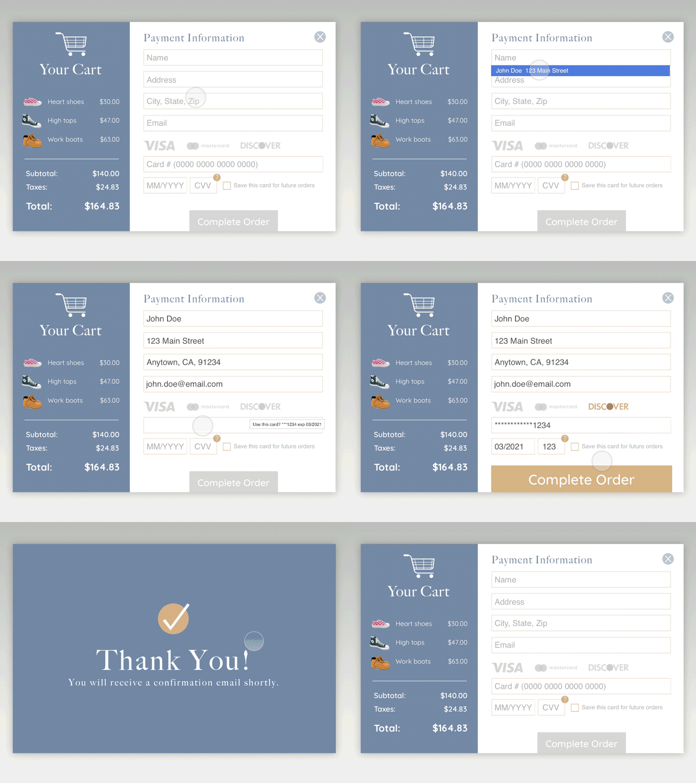
Daily Ui 002 Credit Card Form
Took some shortcuts in the process using autofill. The two things I really wanted to communicate were the CC type highlight/confirmation and how the complete order button "jumps" as a CTA after everything is complete. If I had more time I would've spent it refining the cart side a little more.
Feedback is more than welcome. My main experience is print design so I'm learning that UI design has it's own challenges and considerations. I'd be grateful to know how I can get better.
More by Jason Garthoffner View profile
Like
