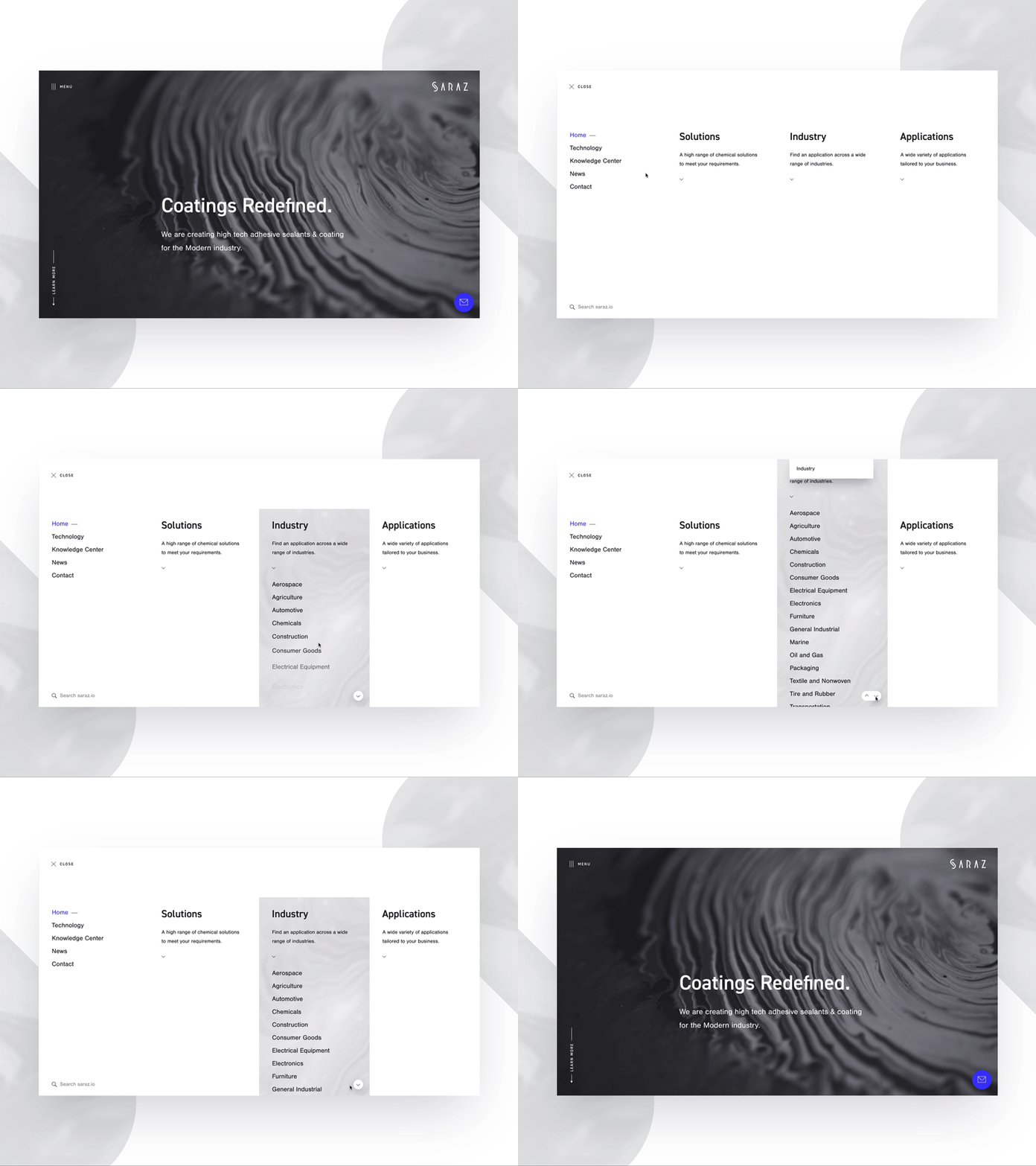
Website menu motion / made with InVision Studio
Menu motion for an upcoming project. The UX challenge was to create a user friendly navigation with 3 vertical submenus. I have been using movement to catch the user's eyes on key elements and gives a natural touch to the navigation.
Menu concept inspired by the @Impossible Bureau website and their cool navigation.
Cool paint textures by Laura Krantz.(https://unsplash.com/@lurm)
_______
P.S. Feedback always welcome. Like [L] and share the love!
_______
epx_menuhover_03.mp4
5 MB
More by Matthieu Souteyrand ▽ View profile
Like


