Notebooks


AMPELMANN Berlin needed some new notebooks in their product range. As I am totally addicted to this kind of stuff, it was a pleasure for me to attend the international trade fair for stationery, "Paperworld" in Frankfurt. There we found lot’s of inspiration and a super nice producer to work with. In close collaboration we decided over dimensions, materials and printing possibilities.
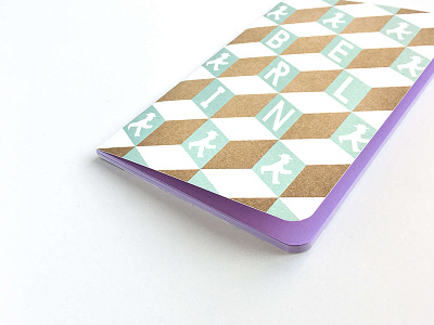
As this was a whole new product group, I did a geometric abstraction of the AMPELMANN® Logo for the backside of every notebook. This makes the name a style element in the design and not an "in your face“ advertisement.
MADE FOR DESIGNERS
My pride and joy is definitely the sketch pad with the carton cover. It's got everything creative minds are longing for. There is some heavy weight, rough paper for the inside, made for drawing the shit out of it. The cover is a 3 mm thick brown carton which not only protects perfectly the inside paper but also gives you the feeling of holding an ancient book in your hands. In terms of usability, the spiral binding was something really important to me because you need your paper to lay down flat whilst drawing.
GRADIENT
For the first time in history the "Pantone Color of the Year" was a blending of two shades so I knew that one of the books needed to get a nice gradient. I couldn‘t use Pantone colors for the prints but I took over the blue-ish rose shades of the "Color of the Year" and interpreted them in my way.