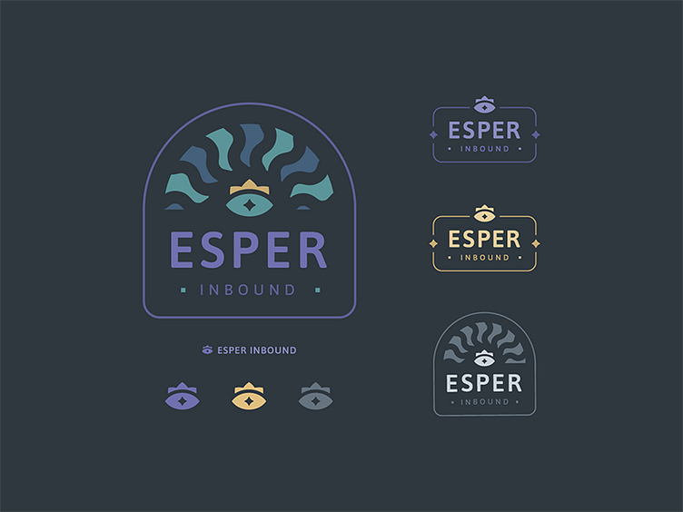
Esper Inbound
I've been experimenting with different color combinations and typography choices. The stars and mark breaking the frame reminded me of the artwork on that doorway to Moria in LOTR Fellowship ⚔️🏔💍 🤓
I like how this typeface has a softness to it when it's bold or even lighter weights. If you like it, it's called ASAP, thanks Google Fonts.
This was a reject, but still fun to work on. We ended up taking our mark and colors in a slightly different direction - more to come ☺️
More by Shane Goodwin View profile
Like

